

Experiencing the Newly Designed Twitter
Upon hearing Twitter’s recent news about the roll out of a fresh design and new features to user profile pages, we just had to experience the changes first-hand. With Twitter’s goal to broaden its appeal, the redesign includes larger photos, more user controls, and an obvious resemblance to Facebook!
At this time, the changes are only in effect for a select group of users and will be deployed globally in the coming weeks. Also, it’s important to note that the new profiles are currently only available to desktop users. We find this strange since mobile is the most popular way to utilize Twitter and is how Twitter earns most of its money.
For those who cannot wait, as was the case for the Newsmaker Group team, just sign up for a new account and the new look is the default starting position. That’s what we did to check out what’s up Twitter’s sleeve, and here are our insights:
o Bolder Visuals Take Center Stage
Visuals have been playing an increasingly important role in Twitter content as evidenced by documented increases in RTs of Tweeted images, and more recently the new ability to Tweet and tag four simultaneous photos. With this month’s profile page redesign, images will now take center stage on our profile pages, as well. Notable changes include larger background images and more prominent profile pictures. Two features obviously “borrowed” from Facebook are the large banner image, which resembles Facebook’s cover photo, as well as the juxtaposed user image in the lower left-hand corner, as pictured below.
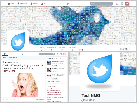
Pictured above are the newly designed header (top of image), tweet section (lower left) and profile picture (lower right)
What we don’t understand is why the Twitter designers only apply the changes to profile pages. It’s awkward for the designs to “switch” when you go from a profile page to home or notifications pages.

The above collage compares the “Home” section (top row), the user profile page (middle row) and the “Notifications” section (bottom row)
o Highlighted Tweets
Another interesting change is how “engagement” impacts a Tweet. Twitter now favors posts that receive higher levels of engagement by enlarging their images and/or including a preview of linked articles, when included. Twitter explains that this change is intended to showcase interesting content. Another benefit is that non-relevant, “spammy” tweets which are not in favor will no longer be on an equal playing field! This change provides additional incentive to create and share fabulous content. After all, who wouldn’t like their Tweet to show-up like the one below rather than just the traditional 140 characters of plain text?
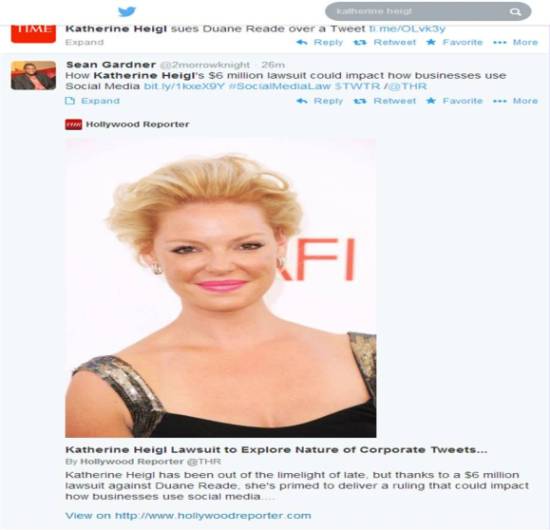
Example of a highlighted tweet
o Filter and Pin Your Tweets
With the new design, you can also filter tweets when viewing others’ profiles. Just choose whether you’d like to see basic tweets, tweets with photos and videos, or tweets and their replies from others. Having options should make the Twitter experience a bit more manageable. Users can also “pin” one of their tweets to the top of their profile page to give others an idea of the topics they follow, and to increase views of particular tweets.
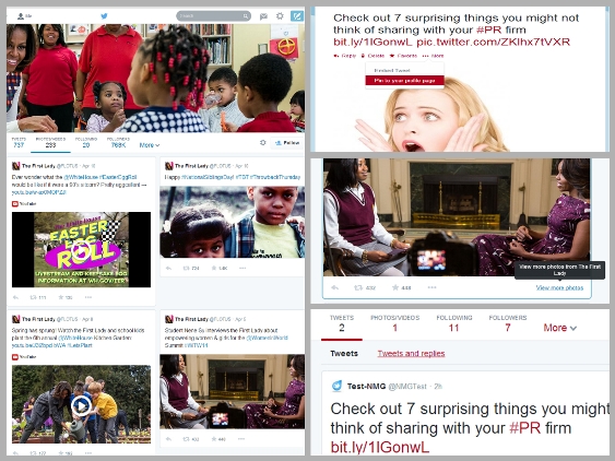
Pictured above is a collage demonstrating:
Filtered “tweets with photos” (left)
How to “pin” your tweet (upper right)
How to filter tweets by photos (middle right)
How to filter tweets by “Tweets and replies” (lower right)
These enhancements will surely make a content marketer’s job more interesting on Twitter. We’ll soon usher out the days of quickly posting simple text tweets with a few hashtags and a link. Instead, it will be important to take the extra time to choose an accompanying image that supports and enhances the tweeted message. However, it shouldn’t be too hard to adjust given that we’re already doing this on Facebook, Pinterest and Instagram, right?
We’re guessing these new design features will eventually be applied beyond users’ profile pages viewed on desktops, to also include home and notifications pages, as well as mobile. We’d be interested in hearing your thoughts on the new design, as well as what might be next!